Dental WebSmart
An organizational tool to support dental practice administrators to set up EFT Payments

Team
Evan Burr Richie Arkanoff
Janna Johns Aidan Sabatino
Ryoma Okano Jackson Murray
Robert Porter Alex Schrankel
Duration
Jan 2022 - May 2022
My Role
Stakeholder interview, User interview,
User flow, Wireframing, Interaction design
Mid-fidelity prototype, Usability testing
Client Background
Dental WebSmart improves dental practices' cash flow by reducing payment turnaround to 2-7 days rather than the previous 30-90 days through Electronic Transfer Fund (EFT) payments.
Project Goal
Dental WebSmart wants to turn its service into a digital product that helps dental practices set up EFT payments by themselves.
Redesign Dental WebSmart’s current web application as an organizational tool to support dental practice administration to set up EFT Payments.
Problem Statement
Dental practice employees handling EFT payments struggle to navigate the EFT setup process. They need a way to easily access multiple dental insurance websites and the essential information to set up EFT payments.
Our Approach
My Contributions
Design
I collaborated with the team to create the new user flow according to our research findings and created the wireframes.
I conducted concept testing and usability testing, iterated, and refined the mid-fidelity prototype.
Teamwork
I mentored 2 first-year students on the team about UX methods and Figma.
I led several meetings with our client to update our progress and ensure a shared vision of the project with the client.
Research
With the team, I conducted secondary research about EFT payments in dental practices.
I conducted 2 user and stakeholder interviews to understand users' needs and clients' goals.
Our Design
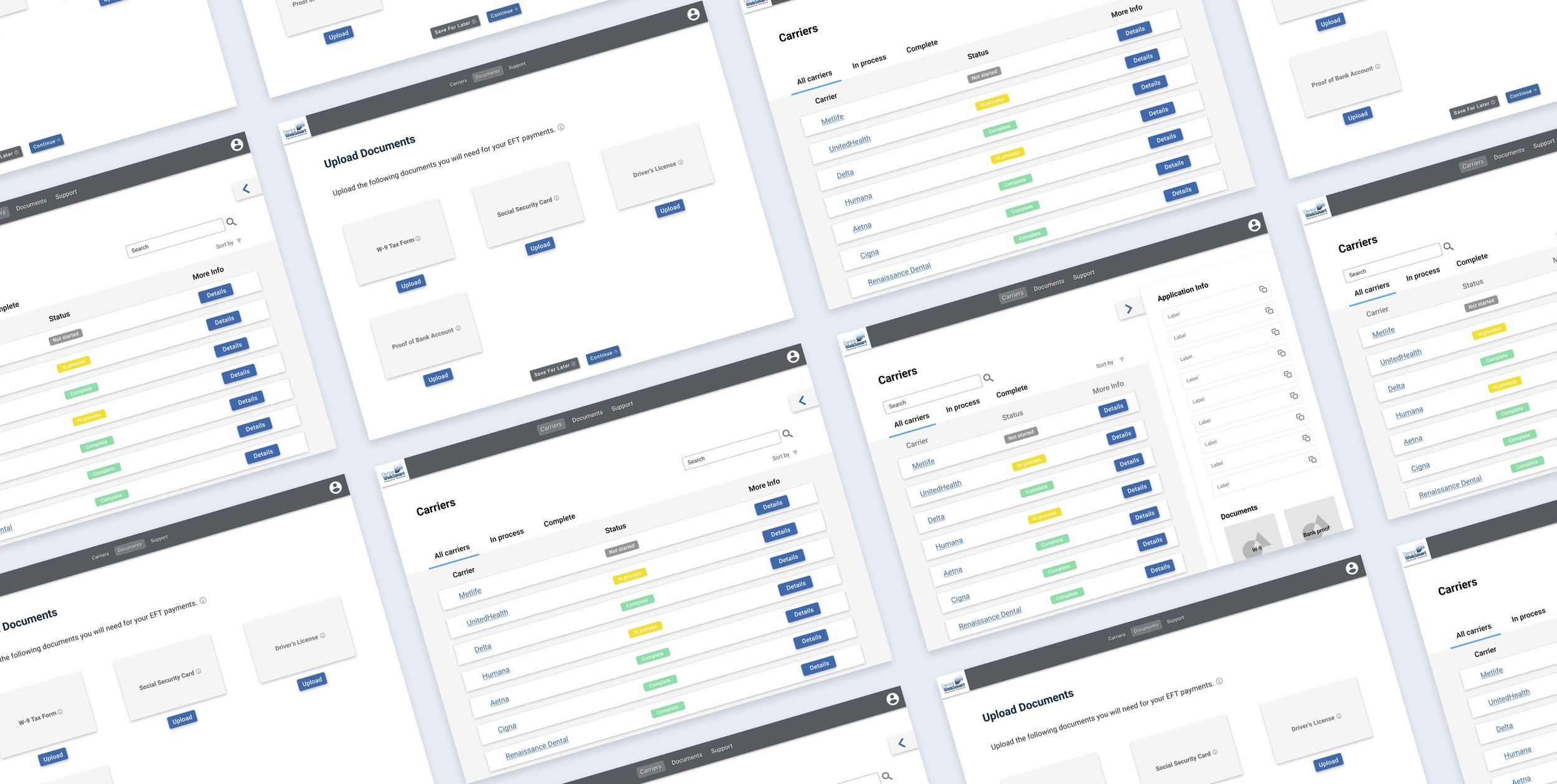
Easily access most dental insurance websites and track the EFT application progress
Users no longer need to search each insurance company's website. The portal provides important information about most insurance companies and a quick link to their website for the EFT application. As the EFT application can take months to complete, users can note down any updates to track their applications.
No more repetitive input of information
The portal guides users to input all necessary information and documents they need to apply for EFT payment. Users can easily copy and paste them into the application.
Support the users throughout the process
Users can find answers to common questions in the support tab and contact customer service for any problems.
Onboarding program for first-time users
The portal provides an onboarding program for first-time users since most administrators at dental practices that do not have an EFT payment are unfamiliar with the application process. Moreover, explaining the use of information in each step helps users understand why they need to input the info.
Research
Understanding the current Dental WebSmart experience
Goals
Articulate the current EFT setup process by researching what it is and how it works.
Investigate the existing user flow and adapt the flow to fit our dental practice administration user group.
Identify information within the current portal that could be eliminated or combined into other tabs to streamline the EFT set up process.
Approach
Clarify terms and processes needed to discuss the current experience
Understand how Dental WebSmart uses the current portal to set up EFT for dental practices
Identify what problems dental practices encounter with EFT
Visualize the current flow
Identify functional necessities in the current site
EFT Research
From the EFT research, we understand the standard flow of setting up EFT payment:
Find the insurance company EFT application website link — Fill out the application form — Wait for approving ( Maybe put on hold because of missed or wrong application info or document — Resubmit the correct information) — Approve
Stakeholder Interview
I interviewed the owner of Dental WebSmart, Chris Haines, who is experienced with using the portal to set up EFT payments for her clients, to identify:
What are the common problems?
How does the Dental WebSmart current portal aids the application process as an organizational tool?
What’s the goal of redesigning Dental WebSmart?
Findings
User Interview
We conducted interviews with 4 potential users, the administrators at dental practices, to understand their knowledge of EFT and what problems they encounter with EFT.
Findings
Unfamiliarity with the EFT setup process
The design of the application website at each insurance company differs a lot, which further increases the difficulty for users who are already unfamiliar with the process.
Difficulty in tracking applications
The application process lasts for months with many back and forth. It's easy to get lost without a centralized tracking system.
Desired to set up EFTs
They know that EFTs reduce payment turnaround to 2-7 days rather than the previous 30-90 days by mail payments which most practices currently use. But it's hard to DIY the application because of the pain points above.
Site Mapping
After understanding the needs of our user group, I conducted site mapping of the current portal with the team to identify relationships within the website and understand how content is connected.
Content Audit
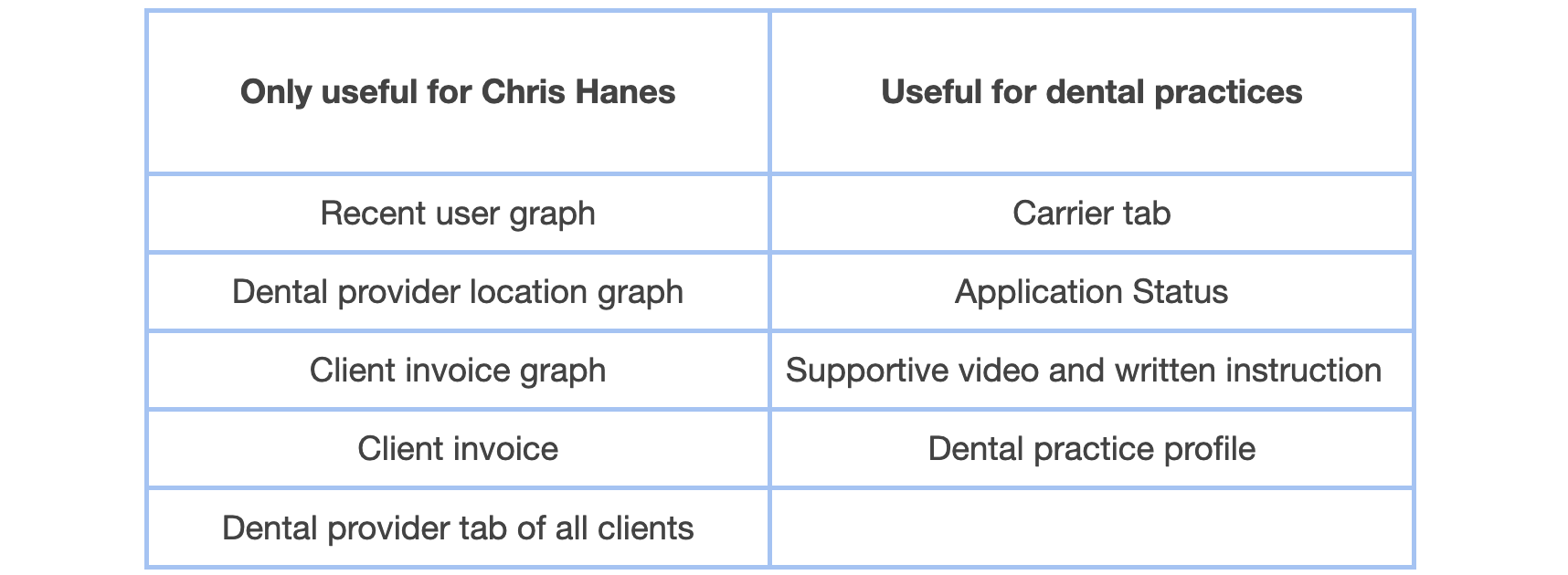
After creating a site map and laying out screenshots of the current portal, we discussed and annotated each screen to identify what each piece of content contributes to the EFT setup process, how the clickable items interact, and which contents are only useful for our sponsor Chris Hanes but not our new user group, the dental admins. It helped us pinpoint what can be eliminated or changed in the design phase.
Findings
As the owner of Dental WebSmart, Chris Hanes, uses the current portal to help set up EFTs for dental practices, we discussed and recognized the contents that are only useful for her but not the new user group, admins at dental practices.
Ideation
We brainstormed for ideas, grouped similar ones, and I organized them according to user needs and design goals.
Initial Wireframing
We created wireframes to visualize our ideas to our sponsor Chris to help her understand the ideas and discuss with us. We wanted to get feedback from her and evaluated our ideas to scale down the ones for further design.
Analysis and Insights
Proposed Redesigned Solutions
We narrowed down these ideas according to the discussion based on their feasibility and usefulness.
Pain Point 1 Unfamiliarity with the EFT setup process
Solutions
Onboarding program for users to follow the steps and understand the process of setting up EFT payments.
Easy copy/paste of needed information to the application websites.
Categorize the resources of articles and videos related to EFTs on the current portal into a support tab for users to look for common questions they have.
Add customer service feature to contact Dental WebSmart for help.
Pain Point 2 Difficulty in tracking application progress
Solutions
Add a note section on the Carrier Info page for users to note any updates from the insurance company, such as reasons for on-holding.
Show the application status on the Main Carrier page to know the status of all applications at once.
Pain Point 3 Need of an easier navigation
Solutions
Merge the Application page and Carrier page on the current portal because most contents are overlapped.
Remove the dashboard because all graphs are only useful for our sponsor, Chris, to keep track of her clients and business. The core function of this portal to our user group, admins at dental practices, is to aid their EFTs setup process, which is covered on the Carrier page.
Design
Information Architecture
After we narrowed down the ideas, we mapped out the user journey map and created the information architecture for the portal.
Fig. Journey Map
Fig. Information Architecture
Wireframing
We created wireframes based on our idea and information architecture for usability testing in the next step.
Evaluation
For the first iteration, we recruited 4 UX students who are experienced with UX design to do concept testing with the think-aloud method. They helped us uncover issues in the design. We improved the wireframe after the first iteration and added the onboarding program. For the second iteration, we invited 2 administrators at dental practices to do the usability testing.
The tasks in usability testing
Sign up for an account
Log in and follow the onboarding program to fill out dental practice information and document
Choose desired insurance company and go to its application website
Copy the information to fill out the application
Update application status in the portal
Iteration
I made changes and created mid-fidelity prototype according to feedback from testings.
The application information block is helpful for users because they don't need to open an extra page to copy and paste their information to the application website. But the screen looks too crowded for participants when they only want to browse the Carrier tab.
Change the application information block to a sliding widget, so the users can open it only when they need it.
Change the navigation bar to a horizontal bar on top for a clearer hierarchy.
The 3-dot icon for status is confusing.
Change it to text bubble stating different status
Remind users to update application by a follow-up question bar.
Participants were confused about why they needed to upload certain documents.
Show tooltip explaining the needs of each document when hovering on the document icons
The system cannot automatically recognize the categories of the documents that the user uploaded.
Change to upload the document separately
Reflection
Working with a big team of 9 students from different years took work, but I learned a lot from this experience. At first, the first-year students seemed less engaged in the project because they were unfamiliar with many design terms and methods and the purpose of every step we planned. So I encouraged them to ask whatever they were confused about to get them onboard. I also mentored them using Figma, explaining the tools such as auto layout and shared components in a design system. This experience helped me polish my own skill in design tools too, as I needed to answer many questions. Another thing I've learned is project management. Since we were a big group, I proposed that we could split into 2 smaller teams for some tasks, which helped our project go more efficiently.


